Technology
From Raw Numbers to Clear Stories - A Simple Guide to Data Collection, Cleaning, and Visualization
In today’s world, almost every decision we make can be improved with data. Whether it’s a doctor analyzing patient records, a business tracking sales, or a student doing a small project, the basic journey is the same: collect data, clean it, and turn it into clear visuals. When each of these steps is done carefully, numbers stop being confusing tables and start becoming meaningful stories that anyone can understand.
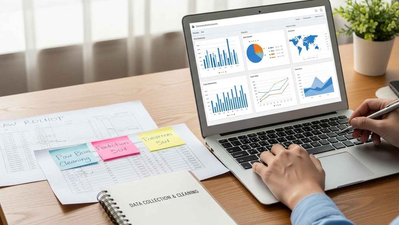
Data collection is the starting point. It means gathering the necessary information to answer a question. Good data collection always begins with a clear goal. For example, a company might want to know which products sell best each month, or a hospital might want to understand which age groups are most affected by a certain disease. Data can come from various sources, including online forms, sensors, surveys, transaction records, websites, and public datasets. What matters most is that the data is relevant, reliable, and collected ethically. That includes respecting privacy, getting permission where needed, and avoiding questions that are unclear or biased. If the data going in is poor or unfair, any conclusions drawn later will also be poor or unfair.
Once data is collected, the next crucial step is cleaning it. Raw data is rarely perfect. It may contain missing values, spelling mistakes, duplicate entries, or numbers that clearly don’t make sense, like a negative age or a date in the future. Data cleaning involves checking for these problems and fixing them. This can include removing duplicates, filling in missing values in a sensible way, correcting obvious errors, or sometimes dropping records that are too unreliable. It also includes standardizing formats, for example, making sure all dates follow the same style or all categories use consistent labels. While cleaning might sound boring, it is often the most important step. Clean data leads to trustworthy insights; dirty data can easily lead to wrong decisions.
Visualization is not just about making things look pretty; it is about communication. A well-designed chart can tell a story in seconds that might take pages of text to explain. For example, a line chart of monthly sales can instantly show seasonality, big peaks at holiday times, and dips in quieter months. A bar chart comparing average test scores before and after a new teaching method can quickly show whether the method helped. In public health, a simple map with colored regions can reveal which communities need more support. When people can “see” the data, they are more likely to understand it, trust it, and act on it.
Behind all this, there is also a responsibility to be honest and fair. It is possible to mislead people with data by choosing only certain points, cutting off axes, or using confusing scales. Ethical data practice means being transparent about how data was collected and cleaned, choosing visualizations that reflect the truth, and clearly stating any limitations. For example, if a survey only includes young adults, the results should not be presented as if they represent the whole population. Clear notes about these limits help readers interpret the visuals correctly and avoid wrong conclusions.
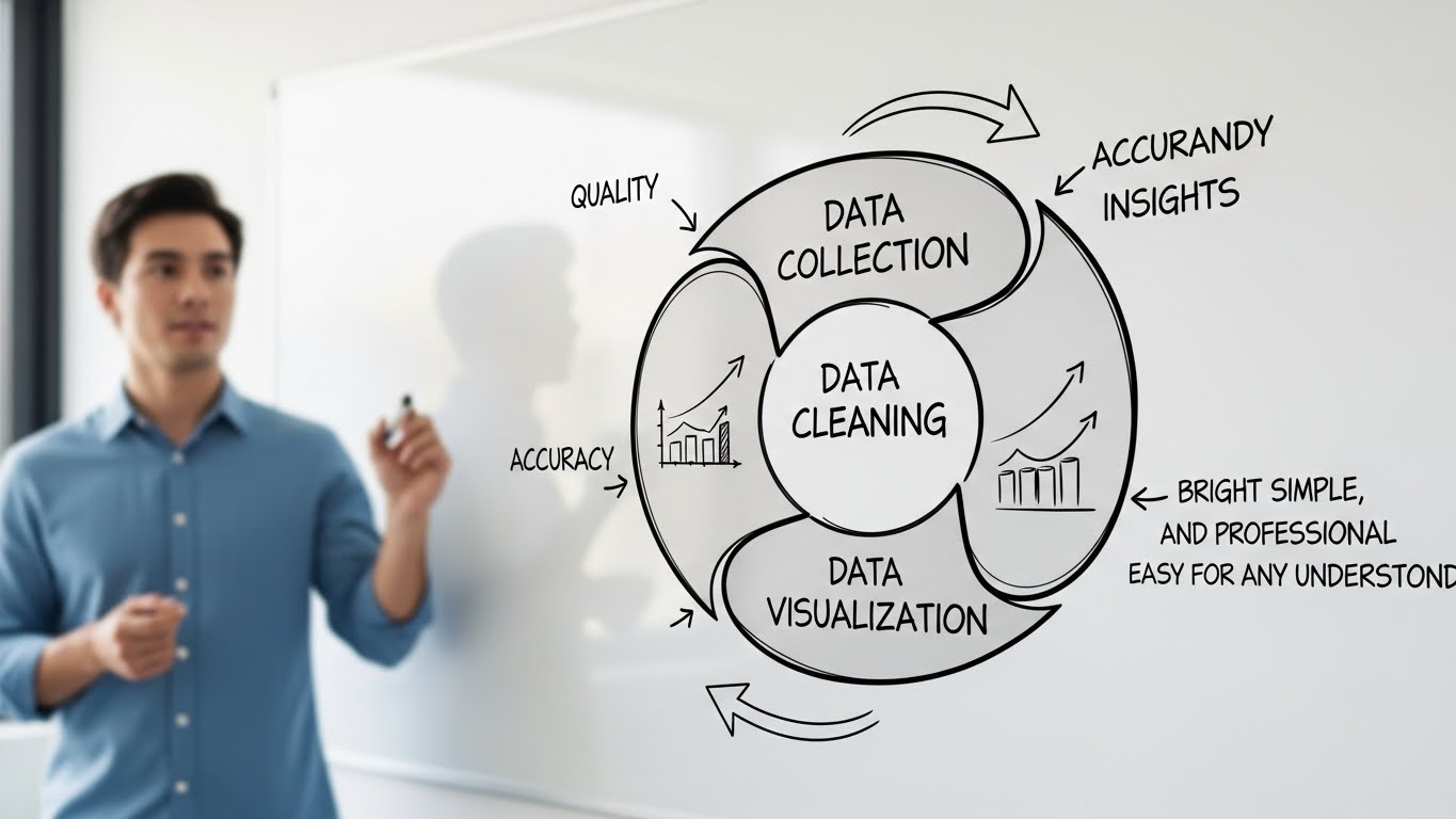
In the end, data collection, cleaning, and visualization form a simple but powerful chain. First, collect the right data for a clear question. Then, clean it carefully so that it is accurate and consistent. Finally, turn it into visuals that tell an honest story. When done well, this process helps students learn, businesses grow, doctors treat patients better, and governments make smarter decisions. You don’t have to be a data scientist to benefit from it; just being thoughtful at each step can turn raw numbers into insights that truly matter.
Test Your Knowledge!
Click the button below to generate an AI-powered quiz based on this article.
Did you enjoy this article?
Show your appreciation by giving it a like!
Conversation (0)
Cite This Article
Generating...